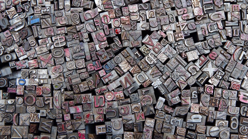
1. Visual Analysis
This image presents a mesmerizing jumble of metal type pieces—a chaotic yet beautiful arrangement of letters, numbers, and symbols once used in traditional printing.
- Composition: The tight framing immerses the viewer in a sea of blocks, where no clear center or focal point exists. The absence of negative space creates a sense of overwhelming detail, drawing the eye across the image in a continuous search for recognizable patterns.
- Texture: The aged, metallic surfaces of the type blocks add a tactile quality. Scratches, wear, and traces of ink hint at years of use, giving the pieces a rugged, industrial charm.
- Color: Muted tones of silver, gray, and black dominate, punctuated by flashes of faded red and hints of blue. The subtle pops of color draw attention to specific blocks, breaking the monochrome monotony.
- Lines and Shapes: The grid-like arrangement of type pieces contrasts with their disordered placement. Letters tilt and overlap, creating diagonal lines and angular intersections that energize the scene.
- Perspective: Shot close-up and from above, the perspective flattens the blocks into a dense visual tapestry, emphasizing the complexity and chaos of the arrangement.
2. Philosophical Reflection
At its core, this image reflects the dual nature of language: orderly and chaotic, functional and artistic. These type blocks are relics of an era when words were shaped by hand, each letter a physical object requiring care and intention.
- The Fragmentation of Communication: The scattered letters speak to the fragmentation of meaning. Individually, they are symbols without purpose; together, they hold the potential to form coherent words, stories, and ideas.
- The Weight of Words: The blocks, heavy and solid, remind us of the physicality of words in the analog age. Each letter had weight, quite literally, reflecting the effort behind communication—an art lost in the digital world.
- The Beauty of Imperfection: The worn surfaces and irregular placements celebrate imperfection. The blocks bear marks of time, like echoes of past prints and forgotten narratives, making them both tools and artifacts.
- Order in Chaos: While the composition feels disordered, there is hidden order here. The letters fit snugly into one another, a reminder that even within disorder, systems can emerge.
3. Practical Photography Insights
This image demonstrates how texture, detail, and perspective can transform a simple subject into a compelling visual story.
- Maximize Texture: Close-up photography with sharp focus brings out the fine details—scratches, ink stains, and metallic shine—that tell the story of the subject.
- Embrace Density: Filling the frame creates visual immersion. The lack of negative space adds intensity and invites the viewer to explore the entire image.
- Play with Chaos and Order: Arrange everyday objects in a way that appears spontaneous but maintains compositional harmony. Let the disarray be intentional.
- Color Accents: Use small bursts of color to create focal points within a sea of monochrome.
Pro Tip: Vintage objects, such as type blocks, offer stories beyond their function. Look for wear, age, and detail to convey history and evoke emotion.
4. Reflections
The type blocks in this image embody more than letters—they hold the memory of stories once told and messages once shared. Each block, individually insignificant, gains meaning when arranged with others. This is the essence of language: singular elements uniting to form something greater.
In a world where communication is instant and intangible, these blocks remind us of the deliberate act of creating words. There was effort in arranging letters, weight in pressing ink onto paper, and beauty in the imperfections that emerged.
The image invites contemplation: How often do we take words for granted? How do symbols shape the way we connect with one another? And what is lost when meaning becomes weightless, stripped of its craft and texture?
Here, in this sea of scattered type, there is a lesson—communication, like art, is not merely about function. It is about intention, care, and the beauty that arises when we give meaning shape.